
Tidying Tank Fighter’s UI with unslop
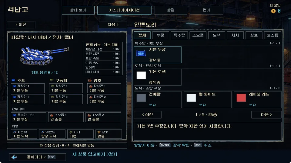
I tidied Tank Fighter’s hangar, main menu, pilot selection, match setup, online menus, records and settings. I applied the spacing, color and information-hierarchy checks from the unslop skill. The tank and pilot artwork, large metal frames and dark navy backgrounds remain, with equipment information arranged to make choosing a loadout easier to follow.
Making the selected item stand out
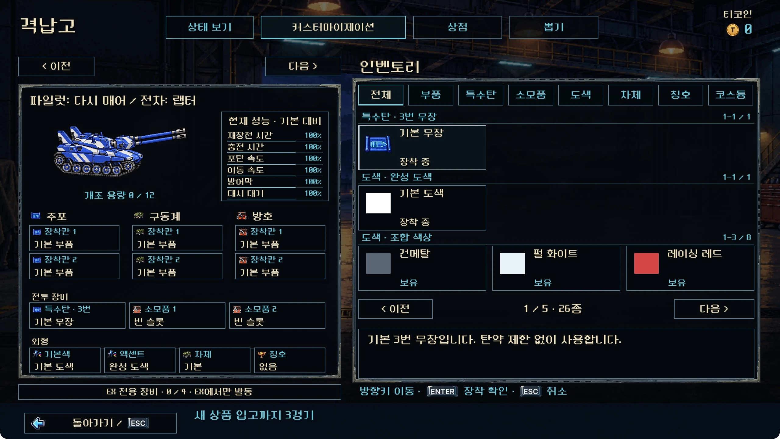
Previously, cyan appeared across inactive tabs, equipment-slot labels and baseline stats. Each element was readable, but together they gave supporting information nearly the same emphasis as the current selection. I changed small outlines and secondary text to a quieter blue-gray, keeping cyan borders and a slightly raised background for selected tabs and equipment. The large image frames and pixel-art equipment icons remain.
Aligning slots and stat values
I set the gap between module slots to 4px and aligned their icons and labels. The stat panel now uses a 20px row pitch with values aligned on the right. I removed the small bars that repeated the adjacent numbers and used a quieter color for baseline values. Existing color distinctions for equipment improvements and drawbacks remain.
Menu focus now uses steady corner marks in place of a continuous idle pulse. Brief confirmation feedback and screen transitions remain. Combat effects and feedback, artwork and audio were unchanged in this pass.
Bringing the other menus into line
I made the main menu’s row spacing consistent and gave the footer’s input instructions a supporting text color. Pilot selection now uses one accent rail instead of repeated rails beside the selected portrait. Match setup has aligned labels, current values and arrows. The pilot and tank artwork and world-map background remain.
In the online menus, descriptions and permanent colored rails no longer compete with the current choice. Record cards now share consistent sizes, spacing, outlines and arrow emphasis while keeping their illustrations. I also refined row spacing and selection feedback in the music room and achievement lists.
Putting volume labels, sliders and values on one line
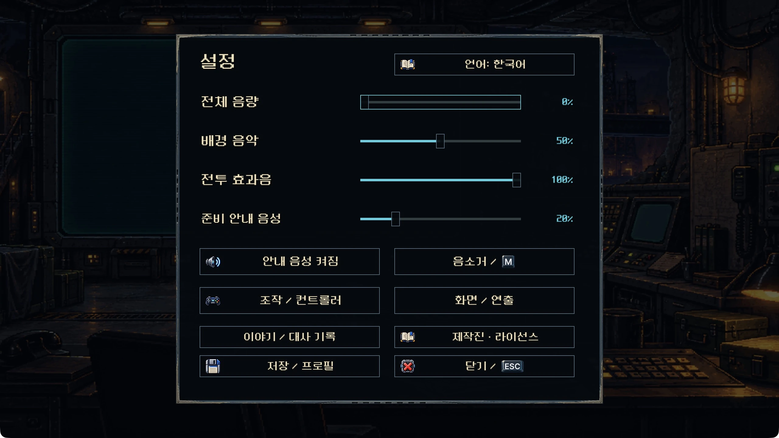
The settings percentages used to float above their sliders. Master volume, music, combat effects and announcement voice now each have a label, slider and value on the same row. Control settings, button assignments and display/presentation settings also received consistent row spacing and button heights.
Checking menus in six languages
I checked 528 menu states across Korean, English, Japanese, Simplified Chinese, Traditional Chinese and German, including whether each screen actually registers navigable controls. The checks reported zero runtime errors and zero measured text overflows. I also checked navigation between the repositioned equipment slots. The Windows and Mac beta is in development; this UI work has reached source integration and editor review.
You can also see the Tank Fighter overview and actual combat footage. The skill used here is unslop by Damir Sokolovsky (@heydamir), published under CC BY 4.0.